
Introduction
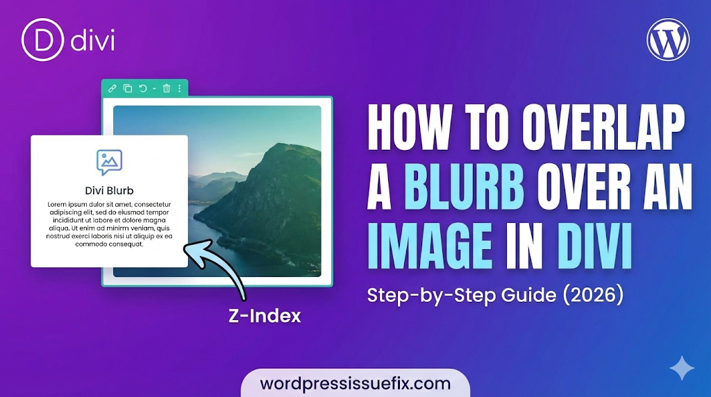
In modern web design, the “grid” is meant to be broken. One of the most popular design trends in 2026 is the use of overlapping elements. Instead of having images and text sit politely next to each other in separate boxes, designers often layer them to create depth, interest, and a professional aesthetic. A common question we receive at wordpressissuefix.com from Divi users is: how to overlap a blurb over an image in Divi without breaking the mobile layout?
If you have tried this yourself, you might have encountered frustrating issues. Perhaps the text disappeared behind the image, or the layout looked perfect on a desktop but completely scrambled on a smartphone. These are common “pain points” for beginners. The good news is that these aren’t bugs; they are simply matters of understanding CSS rules like “Z-Index” and “Negative Margins.”
In this comprehensive guide, we will walk you through the exact steps to create a stunning overlap effect. We will cover the layout setup, the styling required to make the text readable, and, most importantly, how to ensure your site remains fully responsive on mobile devices. Whether you are building a portfolio, a service page, or a blog layout, mastering overlaps will elevate your Divi design skills.
Table of Contents
Understanding the Mechanics: Z-Index and Margins
Before we dive into the “how-to,” it is vital to understand the “why.” When you ask how to overlap a blurb over an image in Divi, you are essentially asking how to manipulate two specific CSS properties using the Divi Builder interface.
1. Negative Margins
Margins are the space outside an element.
- Positive Margin: Pushes elements away from each other.
- Negative Margin: Pulls elements closer, effectively allowing them to cross the boundary of their neighbor. To make a blurb sit on top of an image, we usually apply a negative top margin to the blurb, pulling it upward into the image’s space.
2. Z-Index (The Stacking Order)
Imagine your website as a stack of papers. The Z-Index determines which paper is on top.
- Default Behavior: Elements that appear later in the HTML code (lower down the page) usually sit on top of earlier elements.
- The Problem: Sometimes, when you pull a blurb up, it slides under the image.
- The Fix: You must assign a higher Z-Index number to the blurb (e.g., 10) and a lower number to the image (e.g., 1).
Why Use Overlapping Layouts?
Why go through the trouble? Why not just put the text next to the image?
- Visual Depth: It creates a 3D effect that makes the site feel dynamic rather than flat.
- Space Efficiency: It allows you to group related content tightly.
- Professionalism: This style is associated with high-end agencies and premium themes.
- Breaking Monotony: It disrupts the standard “Image Left, Text Right” flow that bores users.
Step-by-Step Guide: Creating the Overlap
Let’s get into the practical application. Follow these steps to create a classic “Blurb overlapping the bottom of an Image” effect.
Step 1: Setting Up the Row and Column

- Open your page in the Divi Visual Builder.
- Add a Standard Section (Blue).
- Add a Row (Green). For this example, choose a 1-column row or a 2-column row. We will use a 2-column row to see how it looks in a grid.
- Row Settings:
- Go to Row Settings > Design > Sizing.
- (Optional) Set Use Custom Gutter Width to YES and reduce it to 1 or 2 for a tighter look.
- Set Equalize Column Heights to YES. This helps with alignment.
Step 2: Adding and Styling the Image
- In the left column, add an Image Module.
- Upload your desired image.
- Design Settings:
- Go to Design > Border. Add a slight border radius (e.g., 10px) if you want soft corners.
- Go to Design > Box Shadow. Add a subtle shadow to lift the image off the background.
Step 3: Adding and Styling the Blurb
- Directly below the Image Module (in the same column), add a Blurb Module.
- Add your Title and Body text.
- Background Color (Crucial):
- Go to Content > Background.
- Select a background color (e.g., White
#ffffffor Dark Grey#333333). - Why? If you don’t add a background, the text will overlap the image directly and might become unreadable against the image colors. You need a solid “card” look.
- Spacing (Padding):
- Go to Design > Spacing.
- Add Padding to the Blurb to prevent text from touching the edges.
- Example: Top: 30px, Bottom: 30px, Left: 30px, Right: 30px.
- Box Shadow:
- Go to Design > Box Shadow. Add a shadow to the blurb. This helps separate it visually from the image it is overlapping.
Step 4: The Magic of Negative Margins

Now, we will move the blurb upwards.
- Stay in the Blurb Module Settings.
- Go to Design > Spacing.
- Find the Margin setting.
- Input a Negative Top Margin.
- Try -50px or -100px.
- You will see the Blurb move upwards, covering the bottom part of the image.
- Adjust Layout: You might want to make the blurb narrower than the image for a stylish look.
- Go to Design > Sizing.
- Set Width to 80% or 90%.
- Set Module Alignment to Center.
Step 5: Controlling the Stack with Z-Index

If your blurb disappeared behind the image when you moved it up, follow these steps:
- Go to the Blurb Module Settings > Advanced > Position.
- Locate the Z Index field.
- Set the value to 10 (or any number higher than the image).
- (Optional) Go to the Image Module > Advanced > Position and ensure its Z Index is lower (e.g., 0).
Congratulations! You have successfully learned how to overlap a blurb over an image in Divi. But wait—don’t publish yet. We need to check mobile devices.
Method 2: Using Transform Translate (Alternative)
While negative margins are standard, Divi also offers the “Transform” options. This is sometimes cleaner for animations.
- Create your Image and Blurb as described above.
- Instead of using Margins, go to Blurb Settings > Design > Transform.
- Click the Transform Translate tab (the icon with arrows).
- Adjust the Y-Axis (vertical) slider upwards.
- This moves the element visually without affecting the actual flow of the document as aggressively as margins do.
Critical Step: Fixing Mobile Responsiveness

This is where most beginners fail. A layout with -100px margin looks great on a desktop screen. However, on a phone screen, that negative margin might cause the text to cover the entire image face, or push content off-screen.
You must use Divi’s Responsive Editing features to reset this.
- Open Blurb Settings > Design > Spacing.
- Hover over the Margin title.
- Click the Mobile Phone Icon that appears. This opens tabs for Desktop, Tablet, and Phone.
- Click on Tablet/Phone:
- Look at the Top Margin value. It currently inherits the
-100pxfrom desktop. - Change this value to 0px (or a smaller negative number like
-20pxif you still want a slight overlap).
- Look at the Top Margin value. It currently inherits the
- Check Width:
- If you set the width to 80% for Desktop, you might want to change it to 100% for Mobile to maximize screen real estate.
Rule of Thumb: Generally, overlap effects are best removed or significantly reduced on mobile devices to ensure readability and prevent touch-target errors.
Troubleshooting Common Overlap Issues
Even with the best instructions, things can go wrong. Here are the most common issues we see at wordpressissuefix.com.
1. The Blurb Text is Hard to Read
- Cause: The background opacity of the blurb is too low, or there is no background color.
- Fix: Ensure the Blurb module has a solid background color (Content > Background). If you want transparency, use
rgba(255,255,255,0.9)to keep it slightly see-through but readable.
2. I Can’t Click Links in the Blurb
- Cause: The Image might have a higher Z-Index, effectively creating an invisible “shield” over your blurb.
- Fix: Go to Advanced > Position > Z Index on the Blurb module and increase the number.
3. Large White Space Below the Section
- Cause: When you move an element up with negative margins, the empty space where it used to be often remains.
- Fix: You may need to apply a Negative Bottom Margin to the Row or Section containing these elements to close the gap.
4. The Shadow is Cut Off
- Cause: If the Row or Column has
overflow: hiddenset, shadows or overlapping elements might get clipped. - Fix: Go to Row Settings > Advanced > Visibility and ensure Horizontal and Vertical Overflow are set to Visible.
Best Practices for Overlapping Designs
To ensure your site maintains high E-E-A-T (Experience, Expertise, Authoritativeness, and Trustworthiness), follow these design principles:
- Consistency: If you overlap a blurb on your “Services” page, use the same style on your “About” page. Inconsistent design looks amateurish.
- Contrast is King: Ensure there is high contrast between the blurb background and the image. A white blurb on a dark image looks crisp. A dark grey blurb on a black image looks muddy.
- Don’t Overdo It: Overlapping is a “spice.” Don’t make every single element on your page overlap. It makes the site chaotic and hard to scan.
- Test on Real Devices: Divi’s mobile preview is good, but always check your site on an actual iPhone and Android device. Browsers render Z-Index slightly differently.
Frequently Asked Questions (FAQ)
1. Can I overlap a module over two different columns?
Yes, but it is trickier. You would need to set the Row Width to fixed values or use absolute positioning. For beginners, it is safer to overlap elements within the same column to maintain responsiveness.
2. Does using negative margins hurt SEO?
No. Google bots read the HTML structure. As long as the text is visible to the user and not hidden off-screen to stuff keywords, styling with negative margins is perfectly safe for SEO.
3. Why is my Z-Index not working?
Z-Index only works on elements that have a “position” value (like relative, absolute, or fixed). Divi usually handles this automatically, but if it fails, go to Advanced > Position and ensure position is set to Relative.
4. How do I overlap an image over another image?
The process is identical. Add two Image modules instead of an Image and a Blurb. Use negative margins on the second image to pull it over the first one.
5. Can I use this for the Divi Blog module?
Yes! You can customize the Blog module layouts using the Divi Theme Builder. You can overlap the “Post Title” over the “Featured Image” using the same negative margin techniques.
Conclusion
Learning how to overlap a blurb over an image in Divi is a gateway skill. Once you master negative margins and Z-Index, you stop being restricted by the standard grid and start designing freely. You can create floating cards, broken grid layouts, and dynamic headers that capture user attention.
Remember the golden rule of web design: Functionality comes first. An overlap that looks beautiful on a desktop but prevents a user from reading content on a mobile phone is a failure. Always prioritize the responsive checks we discussed in this guide.
By following these steps, you can create a professional, high-end look for your WordPress site without needing to hire a developer.


