
Introduction
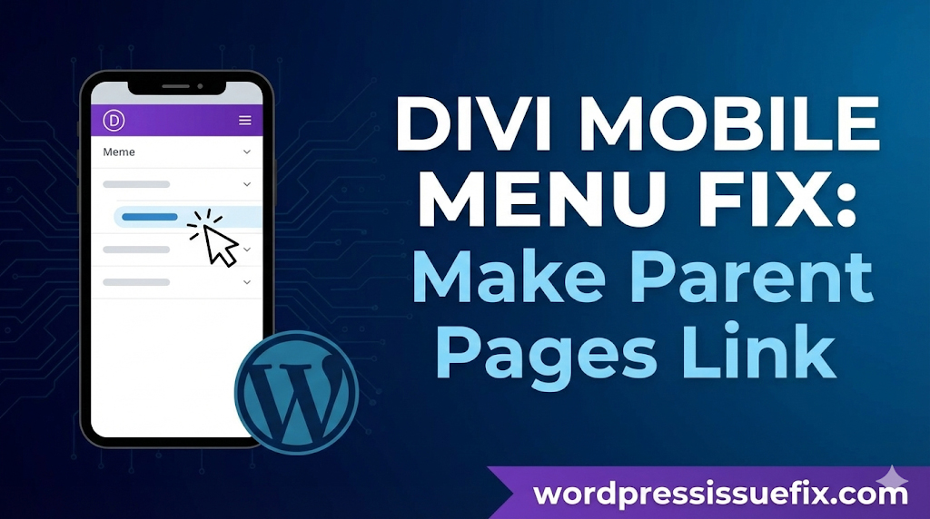
One of the most common frustrations for Divi theme users is the default behavior of the mobile menu. When you build a beautiful responsive website, you expect your navigation to work intuitively. However, many users report a specific problem: how to make parent pages link in Divi mobile menus instead of just toggling the dropdown.
In the standard Divi mobile menu, clicking on a parent menu item (a link that has sub-items underneath it) often acts solely as a toggle switch. It opens the sub-menu to reveal the child pages but prevents the user from actually visiting the parent page itself. This can be disastrous for User Experience (UX). If that parent page contains vital information—like a “Services” overview or a “Products” landing page—your mobile visitors might never see it.
This issue arises because mobile devices do not have a “hover” state like desktop computers. On a desktop, you hover to see the dropdown and click to visit the link. On mobile, the “tap” has to decide whether to open the menu or visit the URL. By default, Divi prioritizes opening the menu.
In this comprehensive guide, we will explore why this happens and provide multiple, safe, and effective methods to fix it. Whether you prefer a no-code workaround or a permanent JavaScript solution, we have a fix tailored for your skill level.
Table of Contents
Understanding the Divi Mobile Menu Behavior

Before applying a fix, it is helpful to understand the logic behind the error. “Error” might be the wrong word; technically, it is a design choice by Elegant Themes (the creators of Divi) to ensure navigation accessibility.
The “Click” vs. “Hover” Dilemma
On a desktop computer, your mouse allows for two distinct interactions:
- Hover: You move the mouse over “Services,” and the dropdown menu appears.
- Click: You click “Services,” and the browser loads the Services page.
On a smartphone or tablet, there is no mouse. You only have a touchscreen. You cannot “hover” with your finger. Therefore, the device interprets a tap as a click.
If Divi allowed the parent link to navigate immediately upon tapping, the user would never be able to open the dropdown menu to see the sub-pages. They would be whisked away to the parent page instantly. To prevent this, Divi’s default script often disables the parent link’s URL action and forces it to act as a toggle for the dropdown instead.
While this makes the sub-menus accessible, it renders the parent page inaccessible from the menu, leaving site owners asking how to make parent pages link in divi mobile menus without breaking the dropdown functionality.
Why This Navigation Issue Hurts Your Site
Ignoring this navigation quirk can have negative effects on your website’s performance and metrics.
- High Bounce Rates: If a user clicks “About Us” expecting to read your story, but nothing happens other than a menu expanding, they may assume the site is broken and leave.
- Lost Conversions: Parent pages are often “Hub Pages” or “Landing Pages” designed to convert visitors. If mobile users (who often make up 50% or more of traffic) cannot access these hubs, you lose potential revenue.
- SEO Structure: Google crawls your site’s mobile version (Mobile-First Indexing). While Google bots can crawl links in the source code, a confusing navigation structure can affect user engagement metrics, which are indirect signals for ranking.
Method 1: The “Clone Link” Workaround (No Code)

If you are not comfortable adding code to your website, the simplest solution is to restructure your menu. This is often called the “Clone Link” or “All Pages” method.
This method accepts the limitation of the mobile menu but provides an alternative path for the user.
Step-by-Step Instructions:
- Go to Your Dashboard: Navigate to Appearance > Menus in your WordPress dashboard.
- Select Your Primary Menu: Ensure you are editing the menu assigned to the “Primary Menu” location.
- Create a Custom Link:
- Instead of using the actual “Services” page as the parent, use a Custom Link.
- URL: Enter
#(a hash symbol). - Link Text: Enter your label (e.g., “Services”).
- Add the Real Page as the First Sub-Item:
- Find your actual “Services” page in the left sidebar.
- Add it to the menu.
- Drag it directly under the Custom Link you just created so it becomes the first child item.
- Rename the Navigation Label: Change the label to something like “All Services” or “Services Overview.”
- Save Menu: Click the Save Menu button.
Why This Works
When a user taps “Services” on mobile, the # link does nothing but open the dropdown. The first item in the dropdown is now “All Services,” which takes them to the page they wanted. It is a user-friendly compromise that requires zero coding.
Method 2: The JavaScript Fix (Recommended Solution)

For those who want the menu to function “perfectly”—where clicking the text visits the link, but clicking the arrow opens the dropdown—you need a small snippet of JavaScript (jQuery).
This is the most professional answer to how to make parent pages link in divi mobile menus. It separates the “text click” event from the “arrow click” event.
How to Add the Code Safely:
- Navigate to Theme Options:
- Go to Divi > Theme Options in your WordPress dashboard.
- Go to the Integration Tab:
- Click the Integration tab at the top of the panel.
- Locate the “Add code to the < head > of your blog” Section:
- Scroll down until you see this text box. This ensures the code loads on every page.
- Paste the Following Code:
HTML
<script>
(function($) {
    $(document).ready(function() {
        // Only run on screen sizes suitable for mobile
        if ($(window).width() <= 980) {
            // Unbind the default Divi click event from the parent link text
            $('#mobile_menu .menu-item-has-children > a').off('click');

            // Re-enable the link for the text only
            $('#mobile_menu .menu-item-has-children > a').on('click', function(e) {
                // Allow the link to function normally
                window.location.href = $(this).attr('href');
            });

            // Ensure the dropdown arrow still toggles the menu
            // Divi usually handles the icon click separately, but this ensures
            // the text click doesn't conflict with the toggle action.
        }
    });
})(jQuery);
</script>
- Save Changes:
- Scroll to the bottom and click Save Changes.
Explanation of the Code
This script targets the standard Divi #mobile_menu. It tells the browser: “If the screen width is less than 980 pixels (tablet/mobile), do not block the click action on parent links.” It forces the browser to follow the URL (href) when the text is clicked. The dropdown arrow (submenu icon) sits outside this anchor tag visually in Divi’s structure, so it retains its toggle functionality.
Note: If you are using a custom header built with the Divi Theme Builder, the ID #mobile_menu might differ. You may need to inspect your code to find the correct CSS ID.
Method 3: Using the Divi Theme Builder
With the introduction of Divi 4.0, many users moved away from the default header to the Theme Builder. If you have built a custom header, the standard fixes might not apply because the CSS classes are different.
Adjusting the Menu Module
- Open Theme Builder: Go to Divi > Theme Builder.
- Edit Global Header: Click the pencil icon to edit your custom header.
- Menu Module Settings: Click the gear icon on your Menu Module.
- Links Settings:
- Sometimes, simply changing the styling of the active link can help users distinguish between the toggle and the link.
- Use Separate Mobile Menu:
- A powerful Theme Builder feature is creating two different menus: one for desktop and one for mobile.
- Create a section that is only visible on Tablet/Phone (Visibility Settings).
- Insert a Menu Module or a Sidebar Module specifically for mobile.
- This gives you total control over the structure without affecting the desktop experience. You can use the “Clone Link” method (Method 1) purely on this mobile menu without cluttering your desktop navigation.
Method 4: Adjusting Menu Structure for Better UX

Sometimes, the technical fix isn’t the best solution. If you are struggling with how to make parent pages link in divi mobile menus, it might be a sign that your site architecture is too deep for mobile users.
Flatten Your Navigation
Mobile users prefer simple, vertical scrolling over deep, multi-level tapping.
- Limit Sub-menus: Try to avoid having sub-menus inside sub-menus (3 levels deep). This is notoriously difficult to navigate on a small screen.
- Use Footer Links: If a parent page is important but causes menu issues, consider adding a “Quick Links” section in your footer. This ensures that even if the menu fails, the user can find the page at the bottom of the site.
Troubleshooting Common Divi Menu Issues

Even after applying the fixes above, you might face issues. Here is how to troubleshoot them safely.
1. Clear Your Caches
If you added the JavaScript code but the menu still isn’t working:
- Browser Cache: Clear the cache on your phone or use “Incognito/Private” mode to test.
- Plugin Cache: If you use WP Rocket, W3 Total Cache, or SG Optimizer, clear the “Page Cache” and “Minified CSS/JS.”
- Divi Cache: Go to Divi > Theme Options > Builder > Advanced and click “Clear Static CSS File Generation.”
2. Check for Plugin Conflicts
Sometimes a third-party plugin interferes with Divi’s scripts.
- Disable all plugins except Divi.
- Test the menu.
- If it works, enable plugins one by one to find the culprit.
- Common culprits: Minification plugins or “Remove jQuery migrate” plugins.
3. Inspect Element IDs
If you are using a specialized Divi Child Theme, the developer might have renamed the menu ID.
- Right-click your menu on a desktop browser.
- Select Inspect.
- Switch to mobile view (Ctrl+Shift+M in Chrome).
- Check if the ID is
#mobile_menuor something else like#main-header. Update the JavaScript code in Method 2 to match the correct ID.
How to Prevent This Issue in the Future
WordPress sites require regular maintenance to run smoothly. Here are best practices to ensure your menus remain functional.
- Update Divi Regularly: Elegant Themes releases updates frequently. Sometimes these updates contain native fixes for accessibility issues. Always backup before updating.
- Avoid Over-Nesting: Keep menus to a maximum of 2 levels (Parent > Child). Avoid (Parent > Child > Grandchild).
- Test on Real Devices: Do not rely solely on resizing your desktop browser window. Test your site on an actual iPhone and Android device, as touch sensitivity works differently than a mouse click.
Frequently Asked Questions (FAQ)
1. Can I fix this without coding?
Yes. The most reliable non-coding method is Method 1 (The Clone Link Workaround). By creating a “Custom Link” parent that leads nowhere (#) and adding the actual page as the first sub-item, you ensure users can access all content without touching a single line of code.
2. Will the JavaScript code slow down my site?
No. The script provided is extremely lightweight (less than 1KB). It only runs after the page has loaded (document.ready) and specifically checks for screen width, so it won’t impact your desktop performance or Google PageSpeed scores.
3. Why does Divi do this by default?
Divi prioritizes the ability to open sub-menus. On touchscreens, there is no “hover.” If the parent link navigated instantly, you would never be able to access the dropdown items. The default behavior is a safety mechanism to ensure sub-menus are reachable.
4. Does this fix work on Divi 4.0 and 5.0?
The JavaScript method generally works on all versions of Divi using the standard header. If you use the Theme Builder, you may need to adjust the CSS ID in the code. The “Clone Link” method works on absolutely every version of WordPress and Divi.
5. Is this issue unique to Divi?
No. Many responsive WordPress themes struggle with the “Parent Link vs. Dropdown Toggle” conflict. However, because Divi is so popular, the question of how to make parent pages link in divi mobile menus is much more common.
6. Will this affect my SEO?
Fixing this issue positively impacts SEO. If Google’s mobile crawler (or a human user) cannot access your parent pages via the menu, those pages may receive less traffic and engagement. Fixing the navigation ensures a better crawl structure and user experience.
Conclusion
A broken or confusing mobile menu can be a major roadblock for your website’s success. While Divi is an incredible theme, its default handling of parent links on mobile devices can frustrate users who expect a seamless navigation experience.
By using the methods outlined in this guide—whether it’s the simple “Clone Link” strategy or the precise “JavaScript Fix”—you can solve the problem of how to make parent pages link in divi mobile menus quickly and safely.
Remember, the goal of your website is to help users find information. A functional menu is the map they use to find it. Take the time to test your changes on multiple devices, clear your caches, and ensure your site is as welcoming to mobile visitors as it is to desktop users.


